PCB swatch

2024-08-05  (Updated 2024-09-23)    3 minute read

Repository: https://git.sr.ht/~jaxter184/pcb-swatch

The main goal of this swatch PCB is to use as a visual reference when creating PCB art, specifically for this life counter project.

A similar project: https://arx.wtf/blog/1-front-panels-tips

Three square printed circuit boards with rounded corners in a row with an almost plaid pattern.
More details on the pattern are outlined later in the blog.
Each board has the same pattern in different colors, except the one on the right has silkscreen in some areas that do
not have solder mask, while the left and center ones have silkscreen only where there is also solder mask.
From left to right, the colors are: white silkscreen on green mask, white silkscreen on black mask, black silkscreen on
white mask.
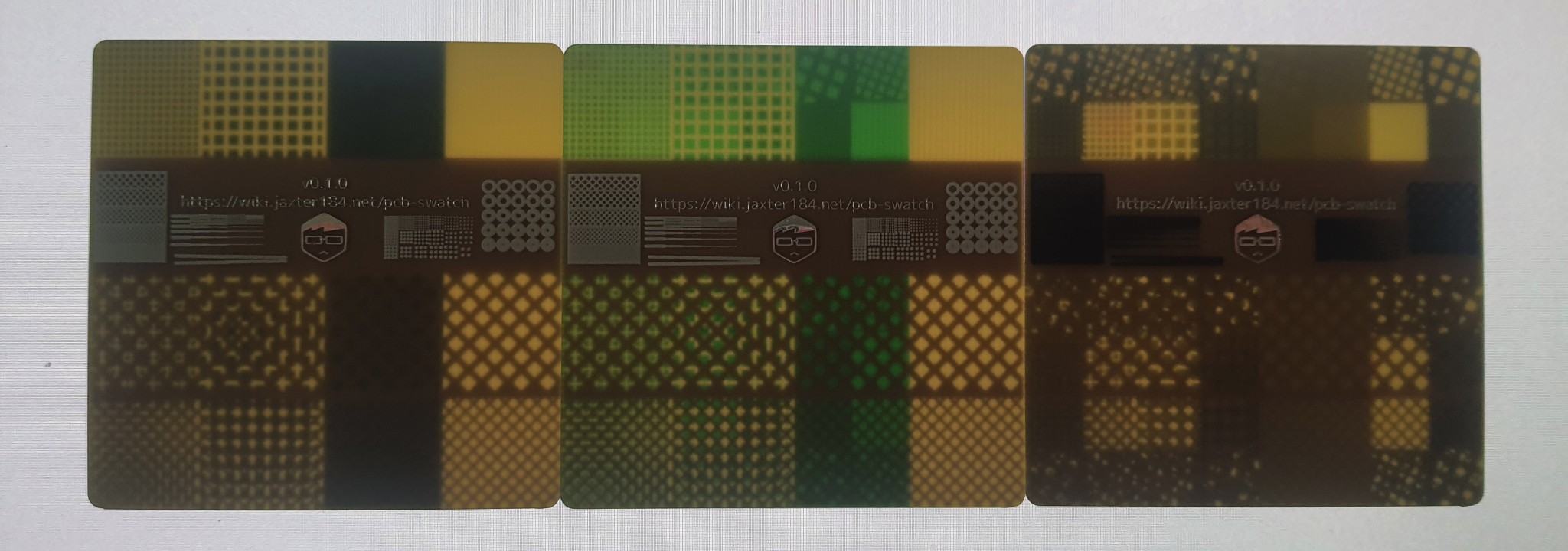
The back of the same circuit boards as the above image.
This side is completely bare (no silkscreen, mask, or copper), except the second of four rows, where there are various
test patterns, and a link to this page and a logo in copper with a HASL finish.
On the left side, the tests are: A hatched grid where the holes get smaller, horizontal lines where the lines get
thinner as you go right and further apart as you go down, two long lines that start about a millimeter apart and get
closer as you go right until they touch.
On the right side, tthe tests are: a grid of dots, getting smaller as you go right, and further apart as you go down,
and a grid of donuts, where the holes get smaller as you go down.
The back of the PCBs again, but illuminated to show that the fiberglass substrate is translucent, and the copper
on the other side blocks light, and the solder mask adds a tint.

I encourage you to download the file!

Design

To show how different layers interact, the front side features every combination of copper, silkscreen, and mask (and lack thereof), plus two sizes of hatching. My favorite combo is probably the one where every layer has small haching.

The back features a couple test patterns to let me know how small my features can be. According to the fab house's support team, the reason that the black silkscreen on white mask came out differently than the other two is because it was processed by a different engineer who skipped a step assuming that I was putting silkscreen over the holes in the mask on purpose. I'm honestly kinda glad that I got a few different versions because I now have references for what the end result is like in both cases.

TODO: closeup pics